ShopDreamUp AI ArtDreamUp
Deviation Actions
Suggested Deviants
Suggested Collections
You Might Like…
Comments12
Join the community to add your comment. Already a deviant? Log In
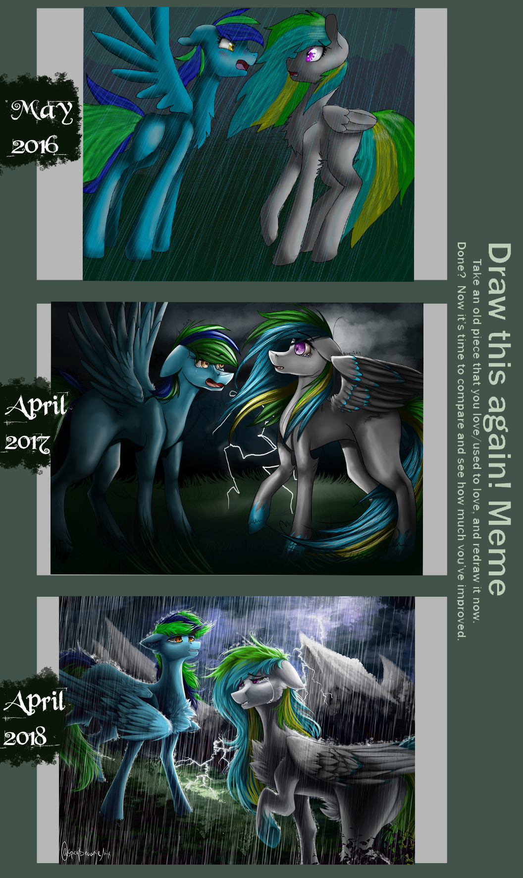
oboy that is some great hecking improvement you got there gurll :''0
if thats alright, i have some overall critiques u3u if you dont feel like it then just ignore them and be proud lol it really does look amazing,,
first of all damn boii that looks so good- and i mean i :0 i see so many details a h i cant even imagine how long it took you ;;
i'd like to point out that even trough the details and color scheme look good, it look a lill too oversaturated ;; the amount of things in such a small space gives a tight uncomfortable feel (its not exactly a bad thing, it fits the image feeling but if that wasnt intentional then be careful, it works with certain feeling but if you want a calm or smooth look it really ruins the whole feeling) it kinda works with the image because all the strong emotions going on,, but if you ever want a more smooth look i recommend a more harmonious use of effects and placement, and also some more open space (like the background) to give it some air to breath.
also, just a quick view on the character's overall view, the colors kinda work together but they seem to be crashing together and with the background, it really makes the characters pop but maybe a lil too much ?;; maybe thats just my personal taste for smooth textured things lololol
also making both characters "the same size (not exactly the same, but i guess you got what i meant) kinda messes up the perspective a bit ;; a bit of the smexy photoshop blur motion effect would make things come along a bit more smooth and nicely, while also helping with the perspective and look of the viewer
sorry bab :'D i just really felt like discussing and critiquing things now hh im so sorry if it sounds mean in anyway <3 my only goal was to give constructive ideas TvT the drawing still looks gorgeous and its so nice to see you improving that much overtime <3


![Thorax and Luna (Celectial Advice\Season 7) [mlp]](https://images-wixmp-ed30a86b8c4ca887773594c2.wixmp.com/f/8b8d534c-fc03-498d-81f4-012215e7f728/db61u3k-060e9bd3-1d26-4908-86ae-dfc98ac5e3f7.jpg/v1/crop/w_184)


![[MAIN] Nayero - Reference sheet 2.0](https://images-wixmp-ed30a86b8c4ca887773594c2.wixmp.com/f/33b19926-5d9d-44c6-bb59-3d6c3006aaf6/ddliw5c-6efbe33c-82b2-4fbe-9000-7fb8a2dbd218.png/v1/crop/w_184)


:origin()/pre00/cff3/th/pre/i/2018/120/b/f/i_thought_you_were_better_v3_by_spicybrowniemix-dcaavep.png)
:origin()/pre00/0bd4/th/pre/i/2017/093/e/a/i_thought_you_were_better_by_spicybrowniemix101-db4jwrl.png)
:origin()/pre00/9fce/th/pre/i/2016/231/7/b/i_thought_you_were_better__by_dubstep53-daekcsl.jpg)